Explore the user-centered thought that went into designing and building the site you are currently navigating.
TOOLS
Figma & Framer
TIMELINE
2 months
ROLE
Designer, researcher, tester, & developer
Like so many in my generation, I was stuck in the classic need-experience-to-get-experience catch.
This case study is my way of tackling both challenges at once. It's a journey of building a portfolio and documenting how I did it.
Main goal is to get the hiring (design) manager to have conversation with me.
Challenge: Portfolio isn’t just passion project. It is a some sort of autobiography. It is a representation of who you are as a designer, communicator, and person.
Research
My exploration began by first question to any UX problem: who is my end user?
I identified the end user as the recruiter or the individual tasked with looking at portfolio’s attempting to find a good candidate.
Then I continued by diving into the world of those who sift through numerous portfolios daily.
The goal?
To empathize with their experience and pain points in existing portfolios.
To achieve this, I created a survey and distributed it in HR slack communities and various subreddits.
However, the response was poor, I collected only 4 responses.
Another problem I ran into was that I didn't know enough recruiters.
To get around this, I read interviews with successful designers and used insights from various articles, videos, consider it a second-hand interview.
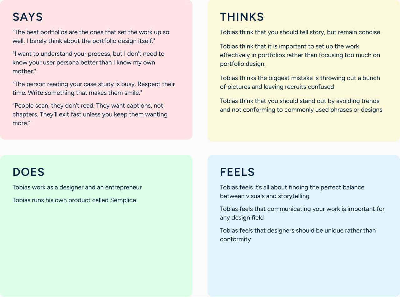
Empathy maps
To organize the data collected, I made empathy maps for each interview I read. This allowed me to highlight reoccurring complaints and preferences.
Pain points
Reoccurring complaints were then broken into three different categories, and pain points were categorized into each.
The portfolio lacks focus on the design process
• Recruiters struggle to assess the thought process of designers, and decisions why they choose specific methods
• Recruiters struggle to understand the skills set of designers when the design process remains unexplained
• Recruiters find it hard to uncover what challenges, trade-offs and technical constrains was behind studies
• Recruiters often fall short in learning about the design process in comparison to the final outcome.
• Recruiters encounter difficulty in finding the specific impact a designer has made on a project.
Hiring managers lacks time and attention
• Recruiters have limited time when reviewing portfolios
• Recruiters are unable to skim portfolio sites effectively.
• Recruiters think long texts are unnecessary
• Recruiters find that a lot of animations, images are distracting
The user experiences a lack of user-centered design
• Recruiters lack engagement due to insufficient storytelling in portfolios
• Recruiters feel overwhelmed by portfolios that contain excessive content
• Recruiters seek stronger visual and layout elements in portfolio sites
• Recruiters doubt a designer's grasp of fundamental design principles
more research
With these pain points, I developed empathy maps, personas, user stories, and user journeys. Some highlights are shown below.
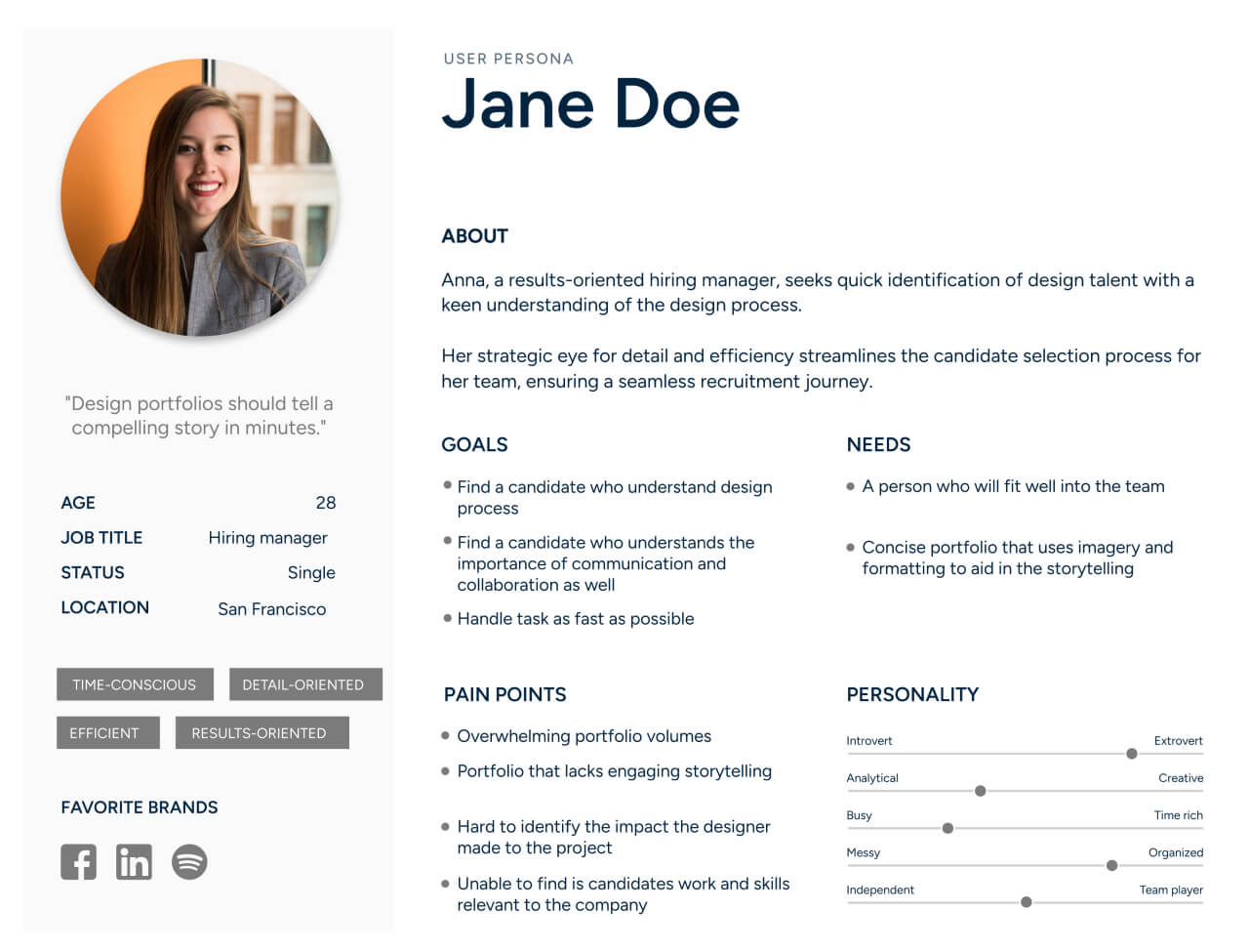
My persona
User stories
1
As a recruiter reading your portfolio, I want to be told a story about your design processes so that I understand how you think (and am entertained).
2
As a recruiter using your portfolio, I want to feel like you created a user-centered product so that I can understand that you practice what you preach.
3
As a recruiter reading your portfolio, I want to read about the challenges you faced, so that I can understand how you overcame them.
problem statement
Now the real problem: how to capture and maintain the attention of recruiters?
My hypothesis: this can be achieved by curating an enjoyable experience for the user while also demonstrating my capabilities as a UX designer, thinker, and person.
The solution I came up with was to showcase my design process in steps that were easily accessible.
For this very reason, I implemented a secondary navigation system. This allowed certain recruiters to navigate to the segment of their choosing quickly and easily.
Additionally, there were two key principles that were incorporated to make the report more user-friendly:
• storytelling
• visual interest
But how to find balance between visual and story?
Ideation
.. just combine all the good parts of other people's.
SWOT / competitive analysis
So, I performed a sort of competitive audit on other portfolio sites.
This audit primarily consisted of noting features and practices I liked or disliked.
In combination with the initial user research I had done, I combined my data and produced a list of features and sections I wanted to include in my site.
Some of the key takeaways are shown bellow.
Leave an impression - Utilize the initial screen with a biography that leaves an impression—embed personality and information about yourself that leaves the reader curious.
Orientate the user - Utilize a secondary navigation bar for each project to help orient the user and find sections they are interested in.
Display real-world outcomes - Demonstrate real results and how your product influenced the original problem statement.
Emphasize how you think - Demonstrate the process, not just the end result.
Ensure the user can skim - Utilize features that assist your users in skimming.
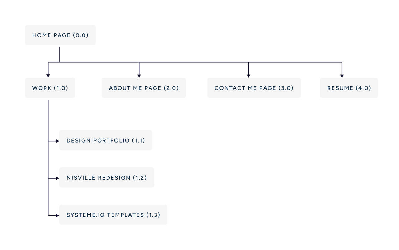
IA / sitemap
This resulted in both a very standard practice and a simple sitemap.
I wanted to keep it as simple as possible, so this resulted in a very standard practice and simple map.
I decided that can live a happy life with just a front page with selected projects, about page and contact page.
At this point, I was satisfied with data I collected, so I can move to the next phase of the project: designing!
Design process
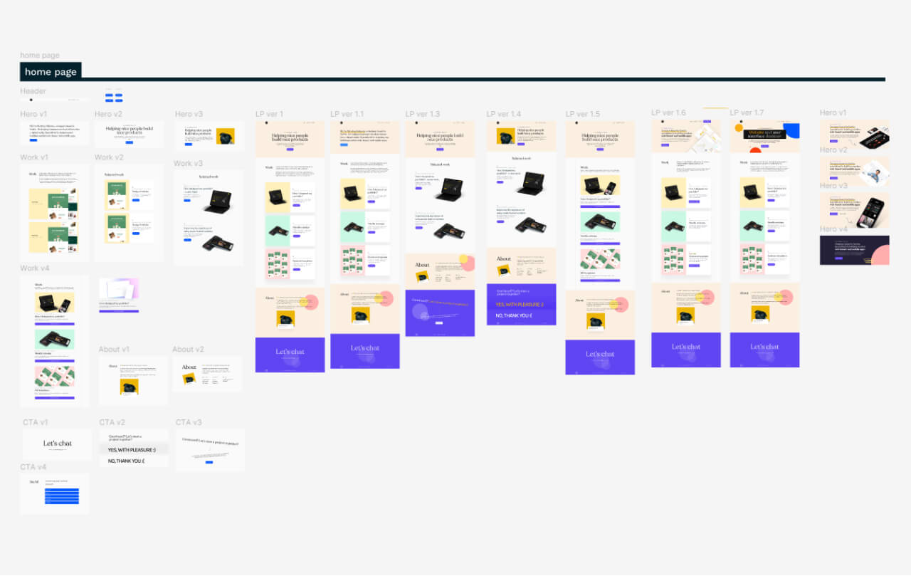
My design process was broken into two cycles: the Ideation Cycle and the Testing Cycling. The Ideation Cycle went back and forth between sketching and creating digital wireframes in Figma.
sketches & digital wireframes
I started with the consideration of hierarchy, layout, sections, IA, which resulted in sketches, scribbles, and lo-fi wireframes. Once I did sketches, I made some rough mid-fi design on Figma and went on improving them.
Visual Design
For me, typography is almost 90% of the design, and so choosing a typeface is therefore the first most important aspect.
After wasting too much time choosing a font, I decided on a combination of Recoleta and DM sans. Both of them have similar line-heights, it looks friendly and I taught it works the best.
To be cohesive with the typeface, colors should be a little warmth.
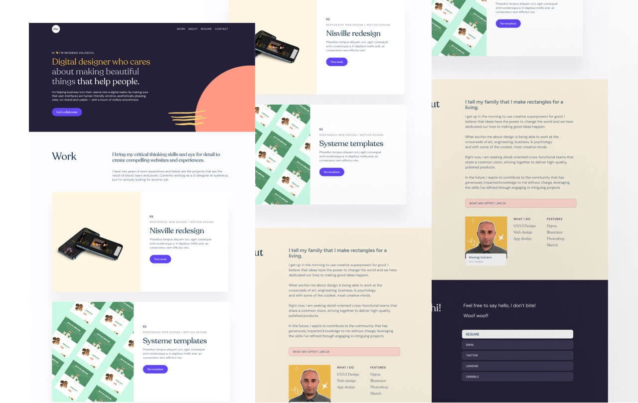
First version
developing
First thing I did is that I forwarded my designs to my design mentor and a few friends, who I felt should take a first look and share their thoughts on it.
Feedback I got:
• it too text focused
• case study needs to be more business focused
• include numbers..
• why you use some of the methods..
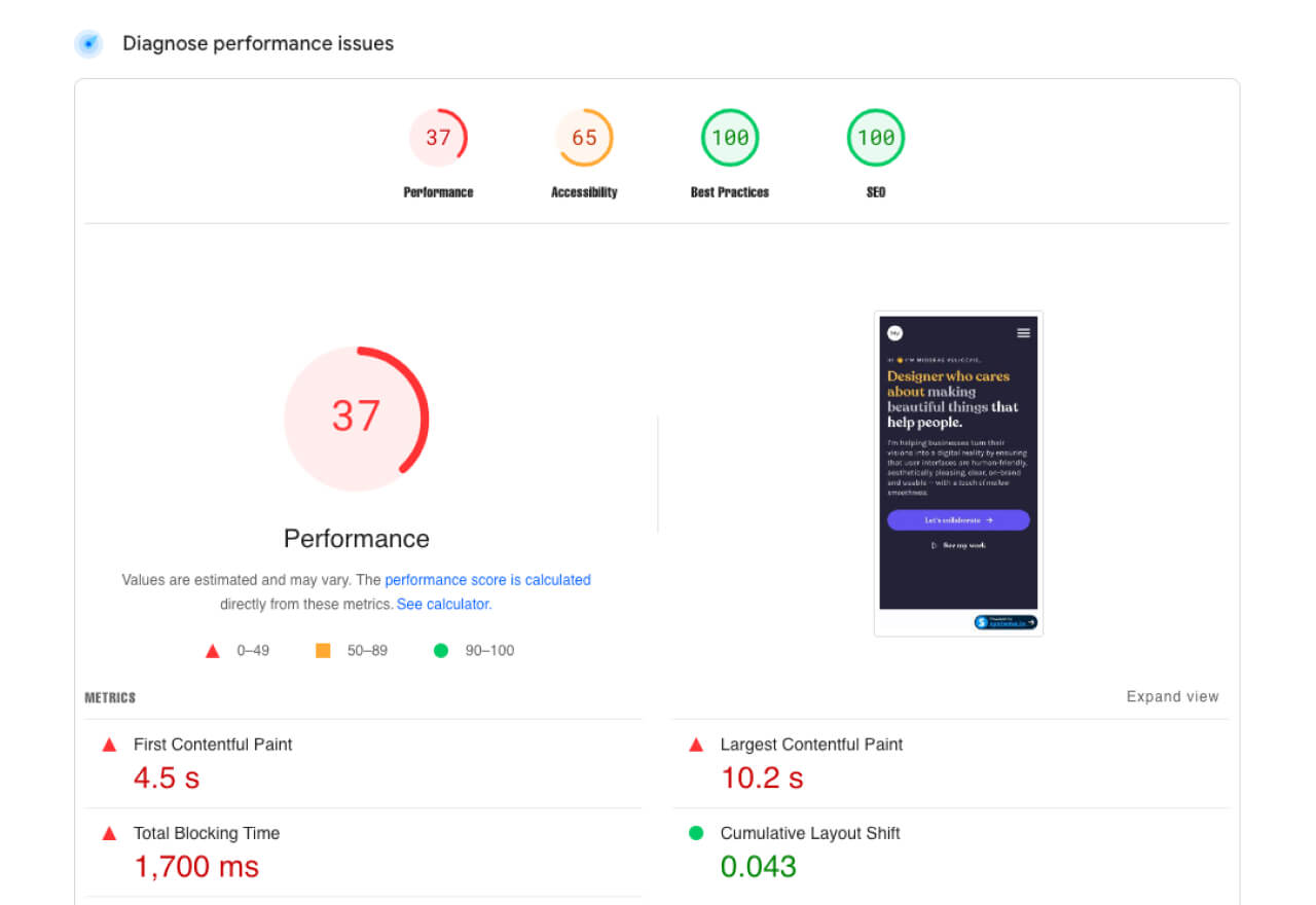
Since site speed plays a big role for me, I tested the site on google speed, and got disappointing data.
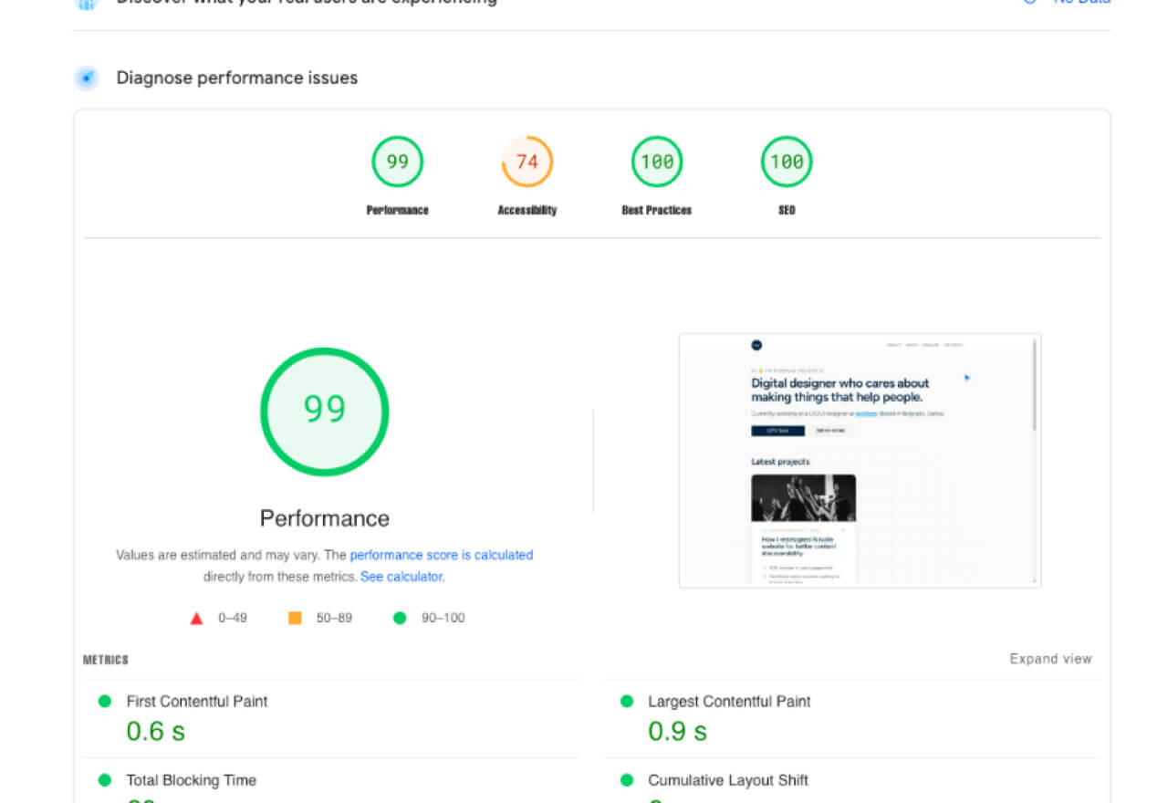
The desktop version got slightly better results, 68 on performance test
Since we know that every second counts, I decided to solve this problem and increase the speed of the site by:
• move to a better platform
• remove unnecessary images and effects
• opt for a different font
• make a minimal portfolio, and throw out all the unnecessary ones
• start from as simple as possible and develop further
Also, to make it easier for recruiters, I optimized the site for scanning by utilizing various visual elements, such as:
• emphasized text
• reduce text
• include more bullet points
changing course of visual
I want to focus on work, so instead of warm colors I will now go for neutrals. I was looking for a minimalist yet friendly typeface, and Figtree seemed like the best option.
After some sketching back and forth, I decided to go with the style you're looking at right now.
moving to framer
I decided to use Framer since it’s been known for best performances, it has small learning curve, since it has similar interface as Figma.
This will also serve as a good practice for me, so that later I can add a framer to my skills arsenal.
Then I tested the site again and got the following results.
The mobile version got 88 on performance test
Testing
Based on research, I saw that recruiters most often find out about candidates through LinkedIn. So I decided to make efforts and enrich this channel.
Also, in addition to LinkedIn, interaction occurs when candidates apply through the website.
So my plan will be to secure a minimum of 50 unique monthly portfolio views by doing these two way synchrony. And to see if portfolio performing well, I’ll test following metrics.
okrs
My intuition tells me that improved user experiences will certainly be good, but how do I know for sure? By having clear objectives and measuring what matters.
Generate feedback or inquiries on 5% of portfolio visits
kpiS
Feedback/inquiries rate: Calculate the percentage of visitors who leave feedback or make inquiries (e.g., via contact forms, emails, linkedin messages, etc..).
Interaction Rate: Monitor clicks on links directed to your resume, LinkedIn profile, or contact information.
Closing..
This is where this study ends, for now..
In the next 2 or 3 months, I’ll apply for as many jobs as I think I would be good fit, and try to optimize my LinkedIn profile.
At the end of the month I will summarize the data and post it here.
